Friday, October 8, 2010

Visual Comm Assignment 3

For our Visual Communication Class we had to analyze a site based on the Rutledge’s axioms.

1.       The most relevant bit of understanding we must possess in order to design an effective website solution for our client is their business objective(s).  This is a true statement. In order to have an effective website the site should include business objectives.  On the Settlement Perspectives site I think that John DeGroote does a decent job on telling the objectives and purposes of the site.
2.       The most efficient way to clearly communicate a page’s visual structure is by using a strong grid. Agreed.  If a page doesn’t have a strong grid then the viewer will just disregard the site.  A strong grid will allow the reader to comprehend the information better.  In the Settlement Perspectives site the designer did a practical design for the page.  You have the company’s logo at the top left corner, then quotes directly under, you have an alphabetized category box on the right, and in the middle you have different articles about negotiation and such.   The page is pretty symmetrical and (for me at least) easy to follow and flow through.
3.       Generally speaking, the lower right is the most effective position for a large image on a text-filled page.  There aren’t any images on the lower right corner, only the category section. 
4.       The most natural and effective direction for leading a viewer’s eye through a web page design or a landscape painting is along an angle.  I agree when information is conducted through angles then the information flows more effectively.  The Settlement Perspective site is to an extent made to flow effectively through the symmetrical page and the three columns of information.
5.       For first-time visitors who have never seen the layout or used the interface of a website, the most important non-brand related issue the designer must take into account for an effective design is a high degree of affordance or intuitiveness.  I think this is true.  The affordance of graphic design or the visual clues as to what the site is about is very effective to someone who hasn’t used the interface of a website.  On the Settlement Perspective page I had to look for what the site was through information; the pictures didn’t tell me what the site was all about; which to me is a default.
6.       The main point of interest is at the area of greatest contrast.  On the Settlement Perspective site the main point is in the greatest area of contrast within the color.  The black and white difference (contrast)  allows your eyes to lead to that contrast which is where the title of the site is found.
7.       Aesthetically pleasing designs are widely perceived as being easier to use than less-aesthetic designs.  Aesthetically pleasing designs are easier to use.  I think that this site was less-aesthetic in the design.  It doesn’t show a natural beauty or any types of emotion, to me at least. 

Monday, September 27, 2010

I went home for the third time in two weeks... oops! it was way fun to see everyone again! Jack turned 3 years old, he was so cute at his party and Leah made him a Bear Lake cake and it is all he could think and talk about all day! In only 11 days Suzy is getting married! I can't even believe it....it feels like yesterday that we were building fires out by the pool at Rebel's Roost and Paul had a secret crush on her.  This week for soccer we have two home games; Thursday and Saturday at 7:30pm.  My parents are coming down for the weekend so that makes for a fun time... obviously! okay that's all!!!!

Visual Communication 3560 Design Project 2

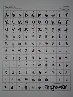
In my Visual Communication class a new assignment was given to make our own font.  I loved the thought of this assignment (if you know me well I am always doodling and making up new letters in my classes).  I went to a site called www.yourfonts.com and printed off a template to make my own font; however, you need a scanner to complete the task, and I don’t.  Then I wrote all my letters on three by five cards.  
The font that someone chooses on the computer or chooses to write with in class describes that individual.  My font is quite fascinating and entertaining; all of the letters are made up on an angle nothing is straight up and down, adding character. If my font were classified as Old Style, Transitional, or Modern, I would say it is a Modern or Didone Font.  There is a major difference and distinction between the thick and thin lines on each individual letter.  To me, this gives my font more personality more to think about when you look at each letter, it isn’t your basic, boring Times New Roman font.  Also, modern fonts are not as easy to read, and I admit mine hand writing isn’t always the easiest to read; however, it isn’t because it is sloppy, it is because of the font itself.   This font can describe me in many (not all) settings; it is very interesting and fun is perhaps the right word, not standard or typical at all. 
Here are some examples of MY FONT!

Sunday, September 12, 2010

Visual Communication 3560 Design Project 1

Presented is a good and poor design within Kellog's cereal boxes.  Also, presented is my analysis and observations from each box.
Kelogg’s Corn Flakes vs. Kellog’s Frosted Flakes. First, in the Corn Flakes box of cereal the title’s writing is horizontal creating almost a dull feeling, not a lot of activity, and a lot of negative space on the rest of the box; whereas, on the Frosted Flakes the text is diagonal creating movement to throughout the rest of the box, also giving the Frosted Flakes more perspective and interest. Next, the Corn Flakes box has a animal shape; whereas, the Frosted Flakes has a animal form, creating depth on the picture. It appears that the tiger is actually popping out of the background instead of blending into the backdrop like on the Corn Flakes box. Again, the Frosted Flake box can be a more positive example of advertisement because of the usage of color; the contrast of the blue and orange colors bring out and allow you to focus your eyes on this box; in the Corn Flakes box the white blends on a shelf display and is poor at grabbing the attention of a potential buyer. The Corn Flakes box doesn’t show any emotion or affection so unless your mind was already set on buying Corn Flakes vs. Frosted Flakes , Frosted Flakes appear to be the better buy in all of these different visual aspects…

Interestingly enough, I did this assignment with Cereal boxes that my roommates and I previously had at our house. so when finding the exact Pictures of the boxes I had examined it also brought up past issues and examples of each box. The Corn Flakes box wasn’t always so unappealing. For example this picture below shows a significant more enthusiasm and interest. The text of the motto is larger, the contrast between the red and green is a lot bigger and distinguishable , and the their doesn’t appear to be as much open space. Personally, I think this box of Kellog’s Corn Flakes gives a greater competition for the Kellog’s Frosted Flakes that I presented.

Tuesday, September 7, 2010

Montana was fun, we won one game and lost one game... Some of us found this outdoor local country concert and danced the night away! It was way FUN! Next game is on Thursday night! Then this weekend... I finally get to go home! i CAN'T wait!

Monday, August 30, 2010

the beginning...

Okay… how to start a blog… I don’t know. I am starting this for my Visual Comm. class but I hope I keep it up after the semester… Currently in my life I am a senior at Dixie State College, last semester EVER! I will graduate in Human Communcations but I'm not quite sure what after that... (I’m a hard worker and very creative so… if you want a resume then email me!!!) I do like it a lot in St. George, but most of the time I wish I were home in Sandy. Everyday I miss my mom and dad, and Jacky, Aud, Nory, Suzanne, oh and Tyler;) For the last three years I have played soccer here at the college. I love it! I currently am playing defense. Last weekend we went to c.a.l.i.f.o.r.n.i.a and played San Bernardino and this weekend we travel to Montana and play in the MSUB tournament… good luck to our team. What else is there about me? I love hanging out with my friends and family… I love ice cream. I love shopping. In my free time I like to play some soccer and I LOVE boating. Well that’s about it for now:)