Monday, September 27, 2010
I went home for the third time in two weeks... oops! it was way fun to see everyone again! Jack turned 3 years old, he was so cute at his party and Leah made him a Bear Lake cake and it is all he could think and talk about all day! In only 11 days Suzy is getting married! I can't even believe it....it feels like yesterday that we were building fires out by the pool at Rebel's Roost and Paul had a secret crush on her. This week for soccer we have two home games; Thursday and Saturday at 7:30pm. My parents are coming down for the weekend so that makes for a fun time... obviously! okay that's all!!!!
Visual Communication 3560 Design Project 2
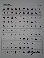
In my Visual Communication class a new assignment was given to make our own font. I loved the thought of this assignment (if you know me well I am always doodling and making up new letters in my classes). I went to a site called www.yourfonts.com and printed off a template to make my own font; however, you need a scanner to complete the task, and I don’t. Then I wrote all my letters on three by five cards.
The font that someone chooses on the computer or chooses to write with in class describes that individual. My font is quite fascinating and entertaining; all of the letters are made up on an angle nothing is straight up and down, adding character. If my font were classified as Old Style, Transitional, or Modern, I would say it is a Modern or Didone Font. There is a major difference and distinction between the thick and thin lines on each individual letter. To me, this gives my font more personality more to think about when you look at each letter, it isn’t your basic, boring Times New Roman font. Also, modern fonts are not as easy to read, and I admit mine hand writing isn’t always the easiest to read; however, it isn’t because it is sloppy, it is because of the font itself. This font can describe me in many (not all) settings; it is very interesting and fun is perhaps the right word, not standard or typical at all.
Here are some examples of MY FONT!Sunday, September 12, 2010
Visual Communication 3560 Design Project 1
Presented is a good and poor design within Kellog's cereal boxes. Also, presented is my analysis and observations from each box.
Kelogg’s Corn Flakes vs. Kellog’s Frosted Flakes. First, in the Corn Flakes box of cereal the title’s writing is horizontal creating almost a dull feeling, not a lot of activity, and a lot of negative space on the rest of the box; whereas, on the Frosted Flakes the text is diagonal creating movement to throughout the rest of the box, also giving the Frosted Flakes more perspective and interest. Next, the Corn Flakes box has a animal shape; whereas, the Frosted Flakes has a animal form, creating depth on the picture. It appears that the tiger is actually popping out of the background instead of blending into the backdrop like on the Corn Flakes box. Again, the Frosted Flake box can be a more positive example of advertisement because of the usage of color; the contrast of the blue and orange colors bring out and allow you to focus your eyes on this box; in the Corn Flakes box the white blends on a shelf display and is poor at grabbing the attention of a potential buyer. The Corn Flakes box doesn’t show any emotion or affection so unless your mind was already set on buying Corn Flakes vs. Frosted Flakes , Frosted Flakes appear to be the better buy in all of these different visual aspects…
Interestingly enough, I did this assignment with Cereal boxes that my roommates and I previously had at our house. so when finding the exact Pictures of the boxes I had examined it also brought up past issues and examples of each box. The Corn Flakes box wasn’t always so unappealing. For example this picture below shows a significant more enthusiasm and interest. The text of the motto is larger, the contrast between the red and green is a lot bigger and distinguishable , and the their doesn’t appear to be as much open space. Personally, I think this box of Kellog’s Corn Flakes gives a greater competition for the Kellog’s Frosted Flakes that I presented.
Subscribe to:
Posts (Atom)


