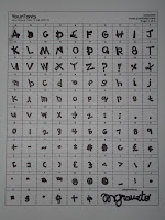
In my Visual Communication class a new assignment was given to make our own font. I loved the thought of this assignment (if you know me well I am always doodling and making up new letters in my classes). I went to a site called www.yourfonts.com and printed off a template to make my own font; however, you need a scanner to complete the task, and I don’t. Then I wrote all my letters on three by five cards.
The font that someone chooses on the computer or chooses to write with in class describes that individual. My font is quite fascinating and entertaining; all of the letters are made up on an angle nothing is straight up and down, adding character. If my font were classified as Old Style, Transitional, or Modern, I would say it is a Modern or Didone Font. There is a major difference and distinction between the thick and thin lines on each individual letter. To me, this gives my font more personality more to think about when you look at each letter, it isn’t your basic, boring Times New Roman font. Also, modern fonts are not as easy to read, and I admit mine hand writing isn’t always the easiest to read; however, it isn’t because it is sloppy, it is because of the font itself. This font can describe me in many (not all) settings; it is very interesting and fun is perhaps the right word, not standard or typical at all.
Here are some examples of MY FONT!

No comments:
Post a Comment